JSF and Twitter Bootstrap Integration

Bootstrap is a popular front-end framework for developing responsive websites, and as the mobile devices are taking a good share of the web browsing, it’s important to consider a mobile friendly website (mobile first).
Starting from PrimeFaces 5.1, PrimeFaces will focus on improving the responsiveness of the components (e.g. p:panelGrid ) depending on the screen size will adjust, so this is a good time to consider adding responsive to your projects.
In this tutorial you’ll need:
- NetBeans
- Maven (3.x)
- JSF (2.x)
- Bootstrap (3.x)
- font-awesome (4.x)
Table of contents:
- Include Bootstrap into a Template
- Implementing Dashboard Template
- Adding font-awesome
You may skip the first step if you have already created the project
1- Include Bootstrap into Template
If you don’t have a template yet, please refer to how JSF 2.0 Templating is done, after you have your template ready download Bootstrap, Once downloaded, unzip the compressed folder to see the structure of (the compiled) Bootstrap. You’ll see something like this:
bootstrap/
├── css/
│   ├── bootstrap.css
│   ├── bootstrap.min.css
│   ├── bootstrap-theme.css
│   └── bootstrap-theme.min.css
├── js/
│   ├── bootstrap.js
│   └── bootstrap.min.js
└── fonts/
    ├── glyphicons-halflings-regular.eot
    ├── glyphicons-halflings-regular.svg
    ├── glyphicons-halflings-regular.ttf
    └── glyphicons-halflings-regular.woff
Copy bootstrap folder into resources
├── resources
│   ├── bootstrap
│   │   ├── css
│   │   │   ├── bootstrap-theme.css
│   │   │   ├── bootstrap-theme.css.map
│   │   │   ├── bootstrap-theme.min.css
│   │   │   ├── bootstrap.css
│   │   │   ├── bootstrap.css.map
│   │   │   └── bootstrap.min.css
│   │   ├── fonts
│   │   │   ├── glyphicons-halflings-regular.eot
│   │   │   ├── glyphicons-halflings-regular.svg
│   │   │   ├── glyphicons-halflings-regular.ttf
│   │   │   └── glyphicons-halflings-regular.woff
│   │   └── js
│   │       ├── bootstrap.js
│   │       └── bootstrap.min.js
│   ├── css
│   ├── images
│   └── js
For the tutorial purpose I won’t work with the minified versions (*.min.css).
Resolving Bootstrap Fonts
Open bootstrap.css under css folder, search for @font-face , you would have something like this:
@font-face {
  font-family: 'Glyphicons Halflings';

  src: url('../fonts/glyphicons-halflings-regular.eot');
  src: url('../fonts/glyphicons-halflings-regular.eot?#iefix') format('embedded-opentype'),
      url('../fonts/glyphicons-halflings-regular.woff') format('woff'),
      url('../fonts/glyphicons-halflings-regular.ttf') format('truetype'),
      url('../fonts/glyphicons-halflings-regular.svg#glyphicons_halflingsregular') format('svg');
}
Now point to the locations of the fonts using #{resource[]}
@font-face {
  font-family: 'Glyphicons Halflings';

  src: url("#{resource['bootstrap/fonts/glyphicons-halflings-regular.eot']}");
  src: url("#{resource['bootstrap/fonts/glyphicons-halflings-regular.eot']}&#iefix") format('embedded-opentype'),
      url("#{resource['bootstrap/fonts/glyphicons-halflings-regular.woff']}") format('woff'),
      url("#{resource['bootstrap/fonts/glyphicons-halflings-regular.ttf']}") format('truetype'),
      url("#{resource['bootstrap/fonts/glyphicons-halflings-regular.svg']}#glyphicons_halflingsregular") format('svg');
}
Integrate Bootstrap into the main template file
In your main template file, include bootstrap.css and bootstrap.js alongside jQuery
jQuery is already shipped with PrimeFaces, but if you don’t use any PrimeFaces component inside your page bootstrap would complain of the missing jQuery dependency
<?xml version="1.0" encoding="UTF-8"?>
<!DOCTYPE html PUBLIC "-//W3C//DTD XHTML 1.0 Transitional//EN"
    "http://www.w3.org/TR/xhtml1/DTD/xhtml1-transitional.dtd">
<html xmlns="http://www.w3.org/1999/xhtml"
      xmlns:h="http://java.sun.com/jsf/html"
      xmlns:f="http://java.sun.com/jsf/core"
      xmlns:ui="http://java.sun.com/jsf/facelets">

    <h:head>
        <f:facet name="first">
            <meta http-equiv="X-UA-Compatible" content="IE=edge" />
            <meta content="text/html; charset=UTF-8" http-equiv="Content-Type" />
            <meta name="viewport" content="width=device-width, initial-scale=1" />

            <title>primestrap</title>
        </f:facet>

        <f:facet name="middle">
            <h:outputStylesheet name="bootstrap/css/bootstrap.css" />

            <script src="https://ajax.googleapis.com/ajax/libs/jquery/1.11.0/jquery.min.js" />

            <h:outputScript name="bootstrap/js/bootstrap.js" />
        </f:facet>

        <f:facet name="last">

        </f:facet>

    </h:head>
    <h:body>

    </h:body>
</html>
To ensure proper rendering and touch zooming, add the viewport meta tag to your <head> .
<meta name="viewport" content="width=device-width, initial-scale=1" />
2 – Implementing Dashboard Template
You can find many template examples, I’ll implement the dashboard template as it’s the most common case.
CSS
Create dashboard.css inside webapp/resources/css (see dashboard.css)
/*
 * Base structure
 */

/* Move down content because we have a fixed navbar that is 50px tall */
body {
  padding-top: 50px;
}


/*
 * Global add-ons
 */

.sub-header {
  padding-bottom: 10px;
  border-bottom: 1px solid #eee;
}


/*
 * Sidebar
 */

/* Hide for mobile, show later */
.sidebar {
  display: none;
}
@media (min-width: 768px) {
  .sidebar {
    position: fixed;
    top: 51px;
    bottom: 0;
    left: 0;
    z-index: 1000;
    display: block;
    padding: 20px;
    overflow-x: hidden;
    overflow-y: auto; /* Scrollable contents if viewport is shorter than content. */
    background-color: #f5f5f5;
    border-right: 1px solid #eee;
  }
}

/* Sidebar navigation */
.nav-sidebar {
  margin-right: -21px; /* 20px padding + 1px border */
  margin-bottom: 20px;
  margin-left: -20px;
}
.nav-sidebar > li > a {
  padding-right: 20px;
  padding-left: 20px;
}
.nav-sidebar > .active > a {
  color: #fff;
  background-color: #428bca;
}


/*
 * Main content
 */

.main {
  padding: 20px;
}
@media (min-width: 768px) {
  .main {
    padding-right: 40px;
    padding-left: 40px;
  }
}
.main .page-header {
  margin-top: 0;
}


/*
 * Placeholder dashboard ideas
 */

.placeholders {
  margin-bottom: 30px;
  text-align: center;
}
.placeholders h4 {
  margin-bottom: 0;
}
.placeholder {
  margin-bottom: 20px;
}
.placeholder img {
  display: inline-block;
  border-radius: 50%;
}
Include dashboard.css into your main template file
<f:facet name="middle">
   <h:outputStylesheet name="bootstrap/css/bootstrap.css" />

   <h:outputStylesheet name="css/dashboard.css" />

   <script src="https://ajax.googleapis.com/ajax/libs/jquery/1.11.0/jquery.min.js" />

    <h:outputScript name="bootstrap/js/bootstrap.js" />
</f:facet>
Pages
- Create header.xhtml under your template folder
<html xmlns="http://www.w3.org/1999/xhtml" xmlns:ui="http://java.sun.com/jsf/facelets"> <ui:composition> <div class="navbar navbar-inverse navbar-fixed-top" role="navigation"> <div class="container-fluid"> <div class="navbar-header"> <button type="button" class="navbar-toggle" data-toggle="collapse" data-target=".navbar-collapse"> <span class="sr-only">Toggle navigation</span> <span class="icon-bar"></span> <span class="icon-bar"></span> <span class="icon-bar"></span> </button> <a class="navbar-brand" href="#">Project name</a> </div> <div class="navbar-collapse collapse"> <ul class="nav navbar-nav navbar-right"> <li><a href="#">Dashboard</a></li> <li><a href="#">Settings</a></li> <li><a href="#">Profile</a></li> <li><a href="#">Help</a></li> </ul> <form class="navbar-form navbar-right"> <input type="text" class="form-control" placeholder="Search..." /> </form> </div> </div> </div> </ui:composition> </html> - Create leftMenu.xhtml under your template folder
<html xmlns="http://www.w3.org/1999/xhtml" xmlns:ui="http://java.sun.com/jsf/facelets"> <ui:composition> <ul class="nav nav-sidebar"> <li class="active"><a href="#">Overview</a></li> <li><a href="#">Reports</a></li> <li><a href="#">Analytics</a></li> <li><a href="#">Export</a></li> </ul> <ul class="nav nav-sidebar"> <li><a href="">Nav item</a></li> <li><a href="">Nav item again</a></li> <li><a href="">One more nav</a></li> <li><a href="">Another nav item</a></li> <li><a href="">More navigation</a></li> </ul> <ul class="nav nav-sidebar"> <li><a href="">Nav item again</a></li> <li><a href="">One more nav</a></li> <li><a href="">Another nav item</a></li> </ul> </ui:composition> </html> - Create content.xhtml under your template folder
<html xmlns="http://www.w3.org/1999/xhtml" xmlns:ui="http://java.sun.com/jsf/facelets"> <ui:composition> <div class="container-fluid"> <div class="row"> <div class="col-sm-3 col-md-2 sidebar"> <ui:include src="leftMenu.xhtml" /> </div> <div class="col-sm-9 col-sm-offset-3 col-md-10 col-md-offset-2 main"> <ui:insert name="content" /> </div> </div> </div> </ui:composition> </html> - Back to your main template file
<?xml version="1.0" encoding="UTF-8"?>
<!DOCTYPE html PUBLIC "-//W3C//DTD XHTML 1.0 Transitional//EN"
    "http://www.w3.org/TR/xhtml1/DTD/xhtml1-transitional.dtd">
<html xmlns="http://www.w3.org/1999/xhtml"
      xmlns:h="http://java.sun.com/jsf/html"
      xmlns:f="http://java.sun.com/jsf/core"
      xmlns:ui="http://java.sun.com/jsf/facelets">

    <h:head>
        <f:facet name="first">
            <meta http-equiv="X-UA-Compatible" content="IE=edge" />
            <meta content="text/html; charset=UTF-8" http-equiv="Content-Type" />
            <meta name="viewport" content="width=device-width, initial-scale=1" />

            <title>primestrap</title>
        </f:facet>

        <f:facet name="middle">
            <h:outputStylesheet name="bootstrap/css/bootstrap.css" />

            <h:outputStylesheet name="css/dashboard.css" />

            <script src="https://ajax.googleapis.com/ajax/libs/jquery/1.11.0/jquery.min.js" />

            <h:outputScript name="bootstrap/js/bootstrap.js" />
        </f:facet>

        <f:facet name="last">

        </f:facet>

    </h:head>

    <h:body>
        <ui:include src="header.xhtml" />
        <ui:include src="content.xhtml" />
    </h:body>
</html>
Finally the templates folder would look like this, assuming you template’s name is default:
.
└── default
    ├── content.xhtml
    ├── header.xhtml
    ├── leftMenu.xhtml
    └── main.xhtml
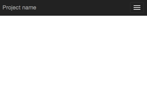
Result
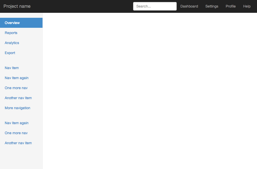
Change the size of the browser’s window to see if you have the responsive “running”, if so you would have something like this
If the responsive is not working as expected, check if you have any errors in your console
3- Adding font-awesome
Font Awesome gives you scalable vector icons that can instantly be customised — size, color, drop shadow, and anything that can be done with the power of CSS.
Download Font Awesome, Once downloaded, unzip the compressed folder to see the structure. You’ll see something like this:
.
├── css
│ ├── font-awesome.css
│ └── font-awesome.min.css
├── fonts
│ ├── FontAwesome.otf
│ ├── fontawesome-webfont.eot
│ ├── fontawesome-webfont.svg
│ ├── fontawesome-webfont.ttf
│ └── fontawesome-webfont.woff
├── less
│ ├── bordered-pulled.less
│ ├── core.less
│ ├── fixed-width.less
│ ├── font-awesome.less
│ ├── icons.less
│ ├── larger.less
│ ├── list.less
│ ├── mixins.less
│ ├── path.less
│ ├── rotated-flipped.less
│ ├── spinning.less
│ ├── stacked.less
│ └── variables.less
└── scss
    ├── _bordered-pulled.scss
    ├── _core.scss
    ├── _fixed-width.scss
    ├── _icons.scss
    ├── _larger.scss
    ├── _list.scss
    ├── _mixins.scss
    ├── _path.scss
    ├── _rotated-flipped.scss
    ├── _spinning.scss
    ├── _stacked.scss
    ├── _variables.scss
    └── font-awesome.scss
Copy font-awesome.css to /webapp/resources/css and copy fonts folder to /webapp/resources/
Our resources folder should look like this
.
├── bootstrap
│   ├── css
│   │   ├── bootstrap-theme.css
│   │   ├── bootstrap-theme.css.map
│   │   ├── bootstrap-theme.min.css
│   │   ├── bootstrap.css
│   │   ├── bootstrap.css.map
│   │   └── bootstrap.min.css
│   ├── fonts
│   │   ├── glyphicons-halflings-regular.eot
│   │   ├── glyphicons-halflings-regular.svg
│   │   ├── glyphicons-halflings-regular.ttf
│   │   └── glyphicons-halflings-regular.woff
│   └── js
│       ├── bootstrap.js
│       └── bootstrap.min.js
├── css
│   ├── dashboard.css
│   └── font-awesome.css
├── fonts
│   ├── FontAwesome.otf
│   ├── fontawesome-webfont.eot
│   ├── fontawesome-webfont.svg
│   ├── fontawesome-webfont.ttf
│   └── fontawesome-webfont.woff
├── images
└── js
Resolving Font-Awesome Fonts
Open font-awesome.css search for @font-face , should look like this:
@font-face {
  font-family: 'FontAwesome';
  src: url('../fonts/fontawesome-webfont.eot?v=4.1.0');
  src: url('../fonts/fontawesome-webfont.eot?#iefix&v=4.1.0') format('embedded-opentype'),
      url('../fonts/fontawesome-webfont.woff?v=4.1.0') format('woff'),
      url('../fonts/fontawesome-webfont.ttf?v=4.1.0') format('truetype'),
      url('../fonts/fontawesome-webfont.svg?v=4.1.0#fontawesomeregular') format('svg');
  font-weight: normal;
  font-style: normal;
}
Now point to the locations of the fonts using #{resource[]}
@font-face {
  font-family: 'FontAwesome';
  src: url("#{resource['fonts/fontawesome-webfont.eot']}?v=4.1.0");
  src: url("#{resource['fonts/fontawesome-webfont.eot']}&#iefix?v=4.1.0") format('embedded-opentype'),
      url("#{resource['fonts/fontawesome-webfont.woff']}?v=4.1.0") format('woff'),
      url("#{resource['fonts/fontawesome-webfont.ttf']}?v=4.1.0") format('truetype'),
      url("#{resource['fonts/fontawesome-webfont.svg']}?v=4.1.0&#fontawesomeregular") format('svg');
  font-weight: normal;
  font-style: normal;
}
In your main template file include font-awesome.css
   <h:head>
        <f:facet name="first">
            <meta http-equiv="X-UA-Compatible" content="IE=edge" />
            <meta content="text/html; charset=UTF-8" http-equiv="Content-Type" />
            <meta name="viewport" content="width=device-width, initial-scale=1" />

            <title>primestrap</title>
        </f:facet>

        <f:facet name="middle">
            <h:outputStylesheet name="bootstrap/css/bootstrap.css" />

            <h:outputStylesheet name="css/dashboard.css" />

            <script src="https://ajax.googleapis.com/ajax/libs/jquery/1.11.0/jquery.min.js" />

            <h:outputScript name="bootstrap/js/bootstrap.js" />
        </f:facet>

        <f:facet name="last">
            <h:outputStylesheet name="css/font-awesome.css" />
        </f:facet>

    </h:head>
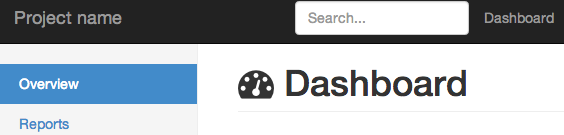
To test font awesome add this to your welcome page, index.xhtml
 <ui:define name="content">
    <h1 class="page-header "> <i class="fa fa-tachometer"></i> Dashboard</h1>
 </ui:define>
See the available icons.
Last step is adding fonts mime types to web.xml (to avoid warnings)
add the following to your web.xml
<!-- web fonts -->
    <mime-mapping>
        <extension>eot</extension>
        <mime-type>application/vnd.ms-fontobject</mime-type>
    </mime-mapping>
    <mime-mapping>
        <extension>otf</extension>
        <mime-type>font/opentype</mime-type>
    </mime-mapping>
    <mime-mapping>
        <extension>ttf</extension>
        <mime-type>application/x-font-ttf</mime-type>
    </mime-mapping>
    <mime-mapping>
        <extension>woff</extension>
        <mime-type>application/x-font-woff</mime-type>
    </mime-mapping>
    <mime-mapping>
        <extension>svg</extension>
        <mime-type>image/svg+xml</mime-type>
    </mime-mapping>
    <mime-mapping>
        <extension>ico</extension>
        <mime-type>image/x-icon</mime-type>
    </mime-mapping>
Conclusion:
Bootstrap is a very nice and elegant front-end framework, especially for busy and non specialised front-end developers, you can find an online demo on the final result.
Also you can Fork or Download the project on Github.
Very good and usefull !
Just one thing : You forgot to add font-awesome in the xhtml page :
Thanks, I’ve included it now.
I’d try, thanks for good tutorial.
Thanks, Hatem, for help on getting started with JSF and Bootstrap. I noticed that the two ui:include elements somehow got misplaced outside of the body element.
Thanks, I’ve corrected it.
fantastic tutorial, thanks!!
great tutorial 😀 Thanks..
Nice tutorial. I integrated with primefaces and my app looks nice.however i didn’t find a way of showing my p:growl which appears hidden by the top bar.how can I do that please.
Hi, how have you done to integrete primefaces?
Nice Tutorial.
Thanks!!!
Just wanted to add to the thanks of the others. Very good work.
Nice work ! thanks for the tutorial
Hi,
Thanks for the tutorial. I have a question , looking at what Twitter Bootstrap can provide ( to JSF and HTML ) why do we need Primefaces? . Why does some one use Twitter Bootstrap and Prime Faces with JSF or HTML when Twitter Bootstrap can provide UI templates and styles ( examples : Admin LTE template for Dashboard bootstrap templates)
Thanks..
PrimeFaces provides an out of the box solution, the components are DRY, self-maintained, and conversion/validation etc.. are provided by simply defining attributes. Above all PrimeFaces is based on JSF whereas bootstrap is merely some CSS/JS hacks. In other words you can have a JSF/HTML/Bootstrap application but you would do so much work in order not to repeat your self by having some custom components and renderers.
hi
is there any support for responsive design with primefaces components?
for example “p:autoComplete” create input field with action button
is there any out of the box support or I have to do it by my own
Recently PrimeFaces started to support responsive in some new components, but not all. You should understand the methodology behind responsive design, after all the components are see are HTML, CSS, and JS. Therefore the implementation of bootstrap or any other responsive framework should be straight forward, for example an input field should have a “form-control” as CSS class. Some more complicated components will require some custom CSS media or/and non media queries even JS might be a must in some cases. In my experience I didn’t take much time to adapt these components into the responsiveness world 🙂
thanks man, clean and right-to-the point
leftMenu.xhtml not displayed in the browser of the phone, why?
You are missing something, check the online demo http://jsf.hatemalimam.com/primestrap/ it’s working fine.
Here’s a screenshot: http://i.imgur.com/d6gqEpe.jpg http://i.imgur.com/AEbDrFE.jpg
I mean the part that is marked with red square http://imgur.com/RRUsKmP . The dashboard works correct. Greetings.
I see what you meant. Anyhow this template is provided by bootstrap examples page, and the original template doesn’t support that (http://getbootstrap.com/examples/dashboard/). You might need to implement that yourself 🙂
Excellent . Thanks for the tutorial. Greetings .
Hi,
Thanks for the tutorial. I have a question, I have found problems with the components of the Primefaces, more specifically datagrid the icones of paginator are not shown on the screen, what could it be?
Very usefull article. Thanks, one question, the theme of primefaces bootstrap is updated? Is very good that theme but i don’t know if is updated.
Hello!
I used your example, but now I don’t see the other icons of paging, editing or any other derived from ui-
Would you have any idea what might be occurring?
Thank you!
Hi ,
Nice example .But if i want apply same css to custom component it is not working.
Like Table, combo box,Multipal select etc.It is working fine for Label,Inputbox .Can you share some example with more primfaces components ,that will really help us.
Thanks
Hi~ I try your method by step, and then it works.thanks,but there is small mistake :
cant’ find the map file
http://localhost:8080/primestrap/javax.faces.resource/bootstrap/css/bootstrap.css.map
I’m study the boostrap,and want to try JSF2 with HTML5
Search in bootstrap.css for “sourceMappingURL” and update it as the following
/*# sourceMappingURL=#{resource['/css/bootstrap/css/bootstrap.css.map']} */Superb tutorial on bootstrap with Primefaces
senthil
Thanks! Your Tutorial is excelent! Now I have my awesome bootstrap template with jsf.
I´m using Primefaces and there are many conflicts with bootstrap and prime components.
How can i mitigate or avoid these conflicts? any ideas? For example, bootstrap modal and tooltip don’t work even using no-conflicts() mode.
And primefaces carousel don’t work. I have done many tests and editions to css and js and i don´t know how to eliminate conflicts. Thanks for your tutorial!!
Besed my of assumptions the order or the place where you are placing the scripts is creating that unexpected behavior.
Make sure that you load one jQuery. Since PrimeFaces loads its own. But again if you follow this post everything should be fine.
Thanx for sample. I ask a question. In main template file is true ?
I think true is :
Mr Alimam,
Very helpful. Thank you so much. Its posts like these that make the Internet a better place.
xhtml is very unforgiving (obviously enough perhaps) —
It looks like JSF (or at least the web.xml settings) treats even the css files as xhtml, It looks like even the bootstrap.css gets turned into bootstrap.css.xhtml .. Any minor missing bracket and you’re stuffed.
Eventually I got this working by copying the bootstrap.css content directly from your demo site rather than using my own. (Someone else might find this useful).
Thanks again
I am regular visitor. This paragraph posted
at this web site is in fact good.
the prime faces component doesn’t show when i add it after the ui component
unless i add a style like “position: absolute left: 100px;top: 150px;” .
is there any solution to integrate primefaces ?
Thanx for sample.
I am new to web development and I am now setup. Thank you this is still useful in 2016. Got me quickly set up in 15 minutes, I had estimated a minimum of 5 hrs. Thank you again. keep up the good work.
Webjars could help you to avoid you to change font urls. see http://www.webjars.org/
very nice thank you
great tutorial.. ive follow each and every step and i got malfunction when the screen smaller, list item is not display after i click right conner button:(
Thanks thanks thanks!!!
Helped a lot, even to this day
You saved my time.Thank you!
Thanx for sample. I ask a question. In main template file is true ?
Thank you for your precious time and effort
I can’t use it, the buttons in the form don’t work
Trackbacks for this post